
Case study · Event Graphics · 2025
Nike Run: Race Against the Unknown
A 14-Floor Transformation Built for Energy, Movement and Scale
The Nike Run campaign required a bold creative vision and a technical approach that could bring that vision to life across an entire multi-storey car park. The space needed to feel energetic, directional and unmistakably Nike from the moment participants arrived. At the same time, the branding had to be functional, safe and capable of guiding thousands of runners through a challenging vertical route.
A fourteen-floor structure offers very little softness. It is concrete, painted metal, exposed surfaces and changeable weather. Instead of feeling like a barrier, Cube Branding treated it as an opportunity. The goal was to create a fast-paced and immersive brand environment that captured the movement and momentum of the event while transforming a utilitarian car park into an experience worth remembering.
The result was a complete takeover and a project that demonstrated the power of cohesive branding at scale.
The Brief
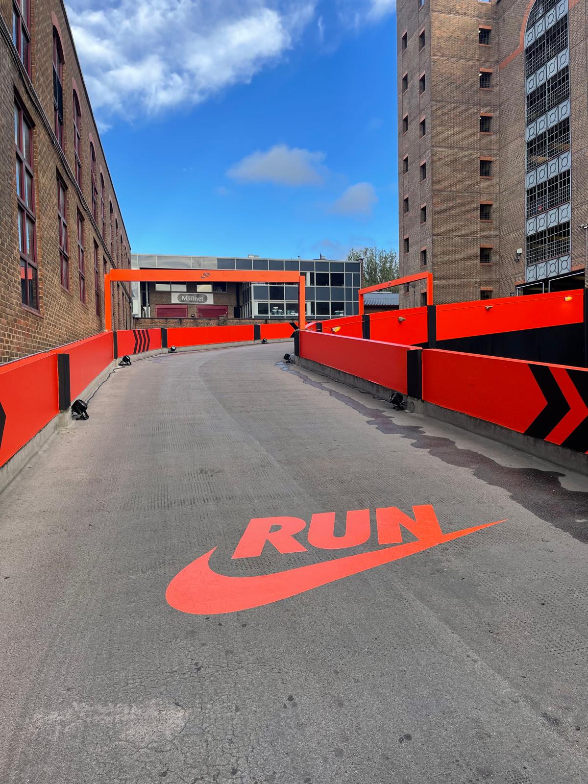
Nike wanted the car park to feel purposeful and alive. Every level needed a clear identity that fed into the next. Floor graphics, wall wraps, directional signage and large scale installations all had to work together, creating a clear route from start to finish. The design had to energise runners, support wayfinding and reflect Nike Run’s visual language.
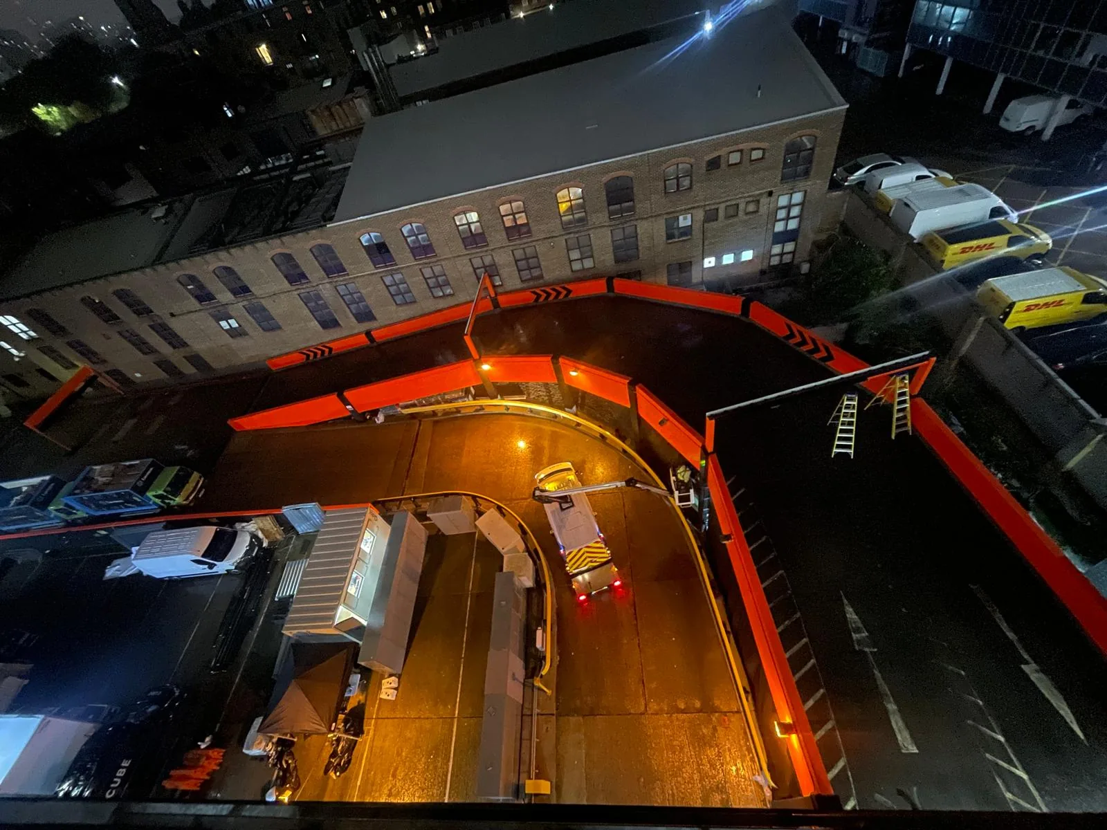
The space covered fourteen floors, each with different surface types and environmental conditions. The branding had to be durable and non-slip, especially on the ramps where the incline and exposed airflow created extra stress on the materials. The project also required a variety of large elements such as oversized floor logos, gradient walls, wrapped barriers and branded fencing. Every detail had to contribute to a single visual story.
This was more than an installation. It was a complete reimagining of a functional space into an experience built around movement and energy.
Planning and Technical Approach
The diversity of surfaces meant that material selection was crucial. High performance 3M films were chosen for their strength, flexibility and durability. Each film was matched to the demands of the surface. Textured high tack films provided safe and reliable adhesion for floor graphics. 3M IJ280 was used for curved signage and areas where extreme conformability was needed. Cast films with UV lamination were used for walls, barriers and fencing to protect the colour intensity in an outdoor environment.
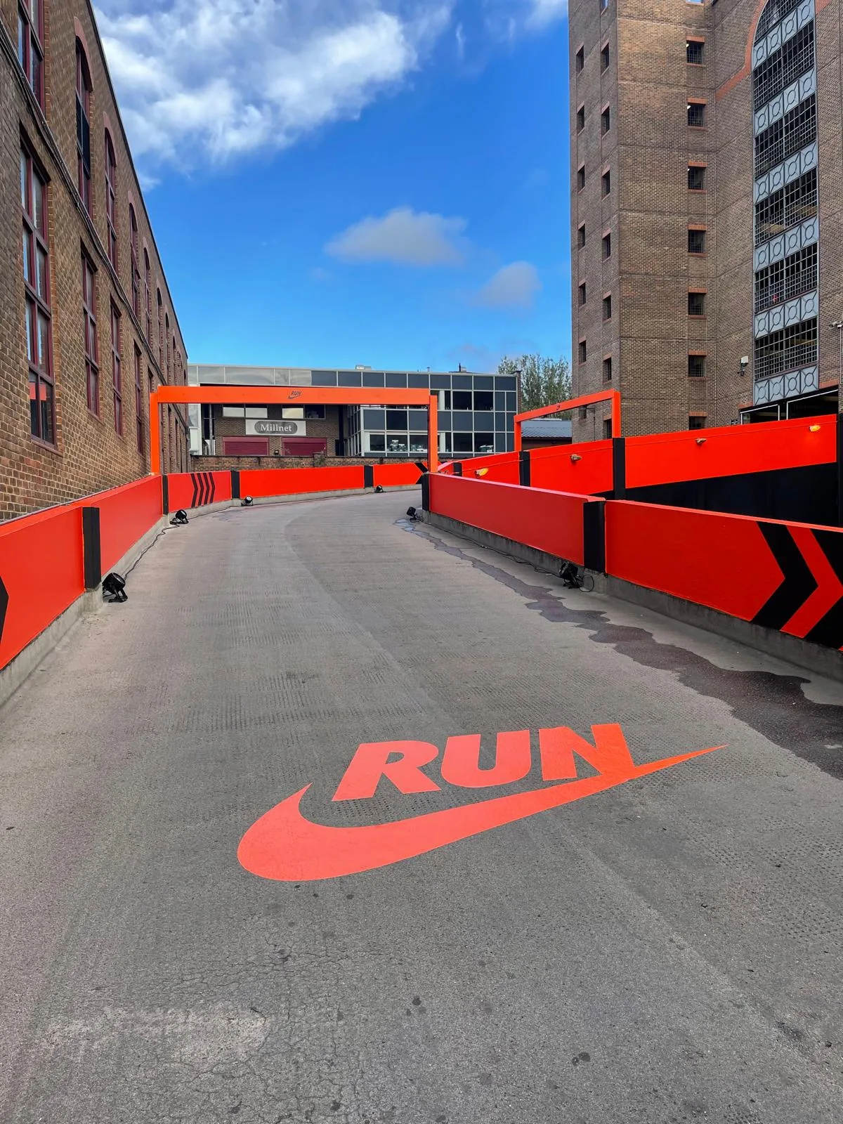
Before installation began, Cube’s production team created a full technical plan for the fourteen floors. This included surface assessments, moisture checks, access details and installation pathways. Custom-cut templates ensured accuracy for the ramp chevrons and the giant “RUN” floor marks. The top floor floor logo stretched more than thirteen metres across and required precise alignment using multi-point reference guides.
Colour consistency was another major factor. With so many individual graphics spread over multiple elevations, colour drift simply was not an option. All prints were produced on HP Latex presses, calibrated throughout the run to keep the brand colours consistent at every scale.
The planning phase set the foundation for a controlled and reliable installation.
Installation Across All Fourteen Floors
The installation took place across an active car park, which required careful coordination. Work had to be sequenced by level. Teams moved up and down the structure while staying clear of operational areas. Several shifts took place overnight to prevent disruption and to keep the programme on track.
Each floor required its own installation sequence. On the ramps, technicians worked with the incline and used controlled heat application to make sure each chevron wrapped cleanly to the concrete. Wall wraps needed careful priming and surface preparation to ensure full adhesion. Outdoor sections on the upper floors were exposed to temperature changes and airflow. These challenges were handled with controlled timing and material selection.
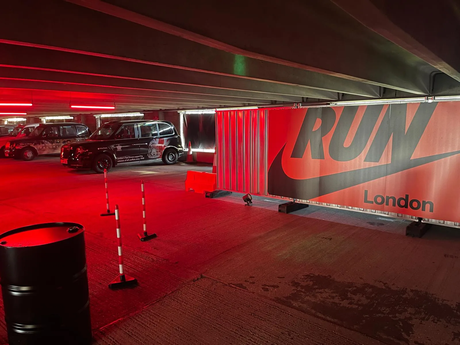
Custom wrapped barriers, stairwell entrances, directional arrows, gate wraps, podium graphics, window banners, printed fencing and vehicle branding were completed in coordinated stages. Every graphic was measured, aligned and checked from multiple viewpoints. By treating each element as part of a single visual journey, Cube ensured that the space flowed with purpose from level one to level fourteen.
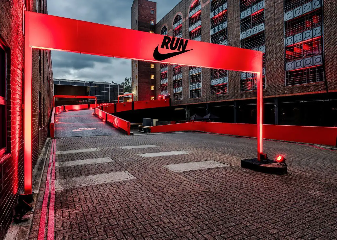
The overhead start and finish signage created a strong anchor at each end of the course. The DJ booth and feature areas were wrapped last, tying the activation together and creating a central point of energy for the runners.
Overcoming Complex Challenges
A project of this size comes with natural challenges. The first was access. Working across fourteen levels required detailed scheduling and constant communication with the site management team. Each area had to be safe, clear and ready for installation.
Surface variation was another challenge. Concrete absorbs moisture and needs priming. Painted walls react differently to pressure and heat. Metal expands and contracts with temperature. Matching the correct vinyl to each surface ensured durability and safety.
Environmental conditions also affected the timetable. Open air levels experienced shifts in temperature and humidity which changed the behaviour of the vinyl during installation. The teams adapted by adjusting application methods and selecting installation windows where the conditions were stable.
The final challenge was time. Nike’s launch schedule left a tight window for installation and de-rig. Cube worked with a coordinated team across long shifts to keep the project running smoothly. Strong communication and calm problem solving were essential throughout.
Despite these challenges, the project delivered on time and to the highest standard.
The Result
The final transformation was striking. A functional concrete car park became a branded environment that felt purposeful, bold and full of energy. Runners experienced a clear journey through the space, guided by colour, signage and large scale directional graphics.
The consistency of the design across fourteen floors created a strong sense of identity. Every section contributed to the overall flow, which made the activation feel cohesive and impactful. The branding remained clean, vibrant and durable throughout the event.
Nike’s team praised the quality of the installation and the commitment shown throughout the project. They highlighted the attention to detail, the alignment across large graphics and the confidence with which Cube handled the complex conditions on site.
Why This Project Stands Out
This activation demonstrates the power of branding at scale. It shows how a challenging environment can be transformed into an experience that supports both movement and storytelling. The project highlights Cube Branding’s strength in delivering large scale installations with accuracy, consistency and creative impact.
The Nike Run takeover pushed the boundaries of what is possible in a multi level branding environment. It stands as a strong example of the value of detailed planning, advanced material understanding and a committed installation team.